Table of Contents
A Comprehensive Guide to Reading Charts, Timing Trades, and Building Consistent Profits on NSE & BSE
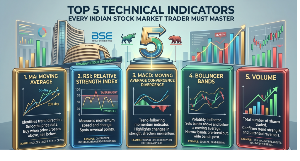
Technical analysis is not a crystal ball — it is a language. Once you learn to read it fluently, the market begins to speak to you in patterns, probabilities, and price action. This guide decodes five of the most powerful technical indicators used by professional traders on India’s NSE and BSE every single day.
Introduction: Why Technical Indicators Matter in the Indian Market
India’s stock market is one of the most dynamic in the world. With over 5,000 listed companies on the NSE and BSE, daily volumes crossing ₹50,000 crore on the cash segment alone, and a growing base of retail investors now numbering over 9 crore registered investors with SEBI, the competition to generate alpha is fiercer than ever.
In such an environment, trading purely on “tips,” news headlines, or gut instinct is a recipe for losses. This is where technical analysis becomes indispensable. Technical indicators are mathematical calculations based on a stock’s historical price, volume, or open interest. They help traders identify trends, momentum, volatility, and potential reversal points — all in real time.
Whether you are trading Reliance Industries on the NSE, swing trading mid-cap IT stocks, or day-trading Nifty 50 futures on the F&O segment, the five indicators covered in this article form the foundation of a robust trading system.
Let’s dive deep into each one.
1. Moving Averages (MA) — The Trend’s Best Friend
What It Is
A Moving Average is one of the oldest and most widely used technical indicators. It smooths out price data by creating a constantly updated average price over a chosen time period, filtering out the “noise” of daily fluctuations to reveal the underlying trend.
There are two primary types you must know:
- Simple Moving Average (SMA): Calculates the arithmetic mean of closing prices over N days. Every data point gets equal weight.
- Exponential Moving Average (EMA): Gives more weight to recent prices, making it more responsive to new information. This makes EMA particularly useful in fast-moving Indian markets.
How to Use It
The 50-day and 200-day EMAs are the gold standard for Indian equity traders. The relationship between these two lines is critical:
- Golden Cross: When the 50-day EMA crosses above the 200-day EMA, it signals a potential bullish trend. This is one of the most reliable buy signals in technical analysis. A Golden Cross on Nifty 50 or a large-cap like HDFC Bank historically precedes sustained upward moves.
- Death Cross: When the 50-day EMA crosses below the 200-day EMA, it signals a bearish trend. Many traders use this as a strict exit signal.
For intraday trading on NSE: The 9-period and 21-period EMAs on a 15-minute chart are extremely popular. When price is above the 9 EMA, and the 9 EMA is above the 21 EMA, you are in a strong uptrend — look only for buy opportunities.
Dynamic Support and Resistance: Moving averages also act as support in uptrends and resistance in downtrends. Notice how Nifty 50 bounces off the 200-day EMA during corrections — this level is watched by every institutional desk in Mumbai.
Practical Example
Suppose TCS is trending upward. The stock corrects slightly and touches its 50-day EMA. If price bounces from this level with high volume, it is a textbook “buy the dip” setup. Your stop-loss goes just below the 50-day EMA, and your target is the previous high.
Key Settings for Indian Markets
- Positional Trading (weeks to months): 50 EMA and 200 EMA on daily charts
- Swing Trading (days to weeks): 20 EMA and 50 EMA on daily charts
- Intraday (minutes to hours): 9 EMA and 21 EMA on 5-minute or 15-minute charts
2. Relative Strength Index (RSI) — The Momentum Meter
What It Is
Developed by J. Welles Wilder, the Relative Strength Index (RSI) is a momentum oscillator that measures the speed and magnitude of recent price changes. It oscillates between 0 and 100, giving traders a clear visual of whether a stock is overbought or oversold.
The standard calculation period is 14 days, though many Indian traders use 9 or 21 periods for more or less sensitivity.
How to Use It
The Classic Interpretation:
- RSI above 70 = Overbought: The stock has risen sharply and may be due for a pullback or consolidation. Not necessarily a sell signal in a strong bull run, but a warning to book partial profits or tighten stop-losses.
- RSI below 30 = Oversold: The stock has fallen sharply. Selling pressure may be exhausted, and a bounce could be imminent. Look for other confirming signals before buying.
- RSI at 50 = Neutral: The midpoint. In an uptrend, RSI tends to stay above 50; in a downtrend, it stays below 50.
Divergence — The Hidden Signal:
The most powerful RSI signal is divergence, and it is widely used by seasoned traders on Dalal Street:
- Bullish Divergence: Price makes a lower low, but RSI makes a higher low. This signals that selling momentum is weakening even as price falls — a strong reversal warning. When this appears in a beaten-down sector like metals or PSU banks, the subsequent rally can be explosive.
- Bearish Divergence: Price makes a higher high, but RSI makes a lower high. This warns that the rally is losing steam. This setup frequently appears in stocks that have run up significantly in a short time on news-driven momentum.
RSI as Trend Confirmation:
In strong trending markets — like the Nifty Midcap 150 during a bull run — RSI often stays in the 50–80 zone. A pullback to the 40–50 range in an uptrending stock is often a buying opportunity, not a danger signal.
Practical Example
Imagine Bajaj Finance drops sharply over three weeks, and the RSI hits 28. You notice that the previous time RSI hit similar levels (late 2022 correction), the stock subsequently rallied 30% over the next two months. Combined with a support zone on the price chart and a bullish candlestick pattern, this sets up an attractive risk-reward trade.
Pro Tip for F&O Traders
On Bank Nifty options, intraday RSI on a 5-minute chart crossing above 50 from below (after an oversold condition) is a popular signal for buying call options at support levels. Always combine with the overall market trend.
3. Moving Average Convergence Divergence (MACD) — Trend + Momentum in One
What It Is
The MACD (pronounced “Mac-D”) is arguably the most versatile indicator in a trader’s toolkit. Invented by Gerald Appel, it combines trend-following and momentum measurement into a single, elegant tool.
MACD is plotted as three components:
- MACD Line: The difference between the 12-period EMA and the 26-period EMA
- Signal Line: A 9-period EMA of the MACD line itself
- Histogram: A bar chart showing the difference between the MACD line and the Signal line — visually representing momentum strength
How to Use It
Signal Line Crossovers — The Core Signal:
- Bullish Crossover: MACD line crosses above the Signal line. This is a buy signal, particularly powerful when it occurs below the zero line (meaning after a meaningful correction).
- Bearish Crossover: MACD line crosses below the Signal line. This is a sell signal, especially significant when it occurs above the zero line (after an extended rally).
The Zero Line:
- MACD crossing above zero confirms that the shorter-term EMA is now above the longer-term EMA — a bullish trend is established.
- MACD crossing below zero confirms a bearish trend.
Histogram Analysis:
The histogram is one of the most underused aspects of MACD. When the bars are growing taller (expanding), momentum is increasing. When the bars are shrinking (contracting), momentum is decelerating — a potential signal of an impending reversal or consolidation.
Watch for histogram contraction after a sustained move. In Indian markets, this pattern frequently precedes sector rotations. For example, when IT sector stocks show MACD histogram contraction after a bull run, money often rotates into FMCG or pharma.
MACD Divergence:
Like RSI, MACD divergence is powerful. If Nifty 50 makes a new high but the MACD histogram makes a lower high, it is a warning sign that the broader market rally is running out of fuel.
Practical Example
You are tracking Infosys on a daily chart. The stock has been in a downtrend for two months. One morning, you notice the MACD line crosses above the signal line while both are still below zero. The histogram turns from red to green. This is a classic early-stage bullish reversal setup — institutional buyers may be accumulating. You enter with a stop below the recent low.
Key Settings
- Standard (Works for Most Indian Stocks): 12, 26, 9
- Faster (For Intraday on 15-min charts): 5, 13, 6
- Slower (For Positional/Long-term): 19, 39, 9
4. Bollinger Bands — Measuring Volatility and Price Extremes
What It Is
Invented by John Bollinger, Bollinger Bands consist of three lines plotted around a stock’s price:
- Middle Band: A 20-period Simple Moving Average (the trend baseline)
- Upper Band: Middle Band + 2 standard deviations (upper price boundary)
- Lower Band: Middle Band − 2 standard deviations (lower price boundary)
The bands expand when volatility increases and contract when volatility decreases, making them a dynamic and self-adjusting indicator — perfectly suited to the volatile nature of Indian mid-cap and small-cap stocks.
How to Use It
The Squeeze — Before the Storm:
When the Bollinger Bands come very close together (the “squeeze”), it means the stock is in a period of low volatility and consolidation. This is the market “coiling like a spring.” A breakout — either up or down — is imminent. Many professional traders on NSE scan for Bollinger Band squeezes as their primary trade setup, then wait for direction confirmation before entering.
This is especially powerful in Nifty 50 index trading. A prolonged squeeze on the weekly Nifty chart often precedes a significant directional move — either a breakout to new highs or a sharp correction.
Walking the Bands:
In a strong uptrend, price “walks the upper band” — it repeatedly touches or hugs the upper Bollinger Band. This is not overbought; it is a sign of strength. The mistake many retail traders make is shorting a stock simply because it is touching the upper band. In a trending market, this is a dangerous strategy.
Conversely, price walking the lower band signals intense bearish pressure.
Mean Reversion Trades:
In a sideways or range-bound market (common in many Nifty 50 stocks during consolidation phases), price touching the lower band is a potential buy signal, and touching the upper band is a potential sell/short signal — with the middle band as the target.
%B Indicator: An advanced use of Bollinger Bands, %B measures where price is relative to the bands on a 0–1 scale. Values above 1 mean price is above the upper band; below 0 means price is below the lower band. Very useful for systematic traders.
Practical Example
Asian Paints has been consolidating for six weeks. The Bollinger Bands are extremely narrow — a textbook squeeze. On a Monday, the stock breaks above the upper band on 3x average volume. This is a high-confidence breakout trade. You enter on the breakout candle’s close, with a stop below the middle band, and target the width of the bands projected above the breakout point.
Key Insight for Indian Traders
Combine Bollinger Bands with sector analysis. When an entire sector (say, auto stocks) simultaneously shows a Bollinger Band squeeze with improving MACD momentum, a sector-wide rally may be loading up. This approach is used by many portfolio managers tracking NSE sector indices.
5. Volume — The Forgotten Indicator That Confirms Everything
What It Is
Volume is the number of shares (or contracts) traded in a given period. It is not a mathematical formula — it is raw market data. Yet it is arguably the most important indicator of all, because price moves without volume are suspect; price moves with volume are conviction.
Every technical pattern, every breakout, every reversal — volume is the lie detector that tells you whether the move is real or a trap.
How to Use It
Volume Confirms Breakouts:
The single most critical rule: a breakout from a consolidation zone, a resistance level, or a chart pattern (cup-and-handle, head-and-shoulders, triangle) is only valid if accompanied by above-average volume — ideally 1.5x to 2x the 20-day average volume.
On the NSE, you can see this pattern repeatedly. When Nifty 50 breaks out of a multi-week range on exceptionally high volume (often the first few days after a major economic announcement — RBI policy, Union Budget, quarterly earnings), the move tends to be sustained and significant.
A breakout on low volume is called a false breakout — one of the most dangerous traps for retail traders.
Volume Precedes Price:
Institutional investors — mutual funds, FIIs, DIIs — cannot take large positions overnight. They accumulate over days and weeks. This accumulation often shows up as gradually increasing volume on green days and decreasing volume on red days, even before the stock makes a significant price move. Smart traders watch for this “volume signature” in quality large-cap and mid-cap stocks.
Volume Dry-Up at Support:
When a stock pulls back to a support level on shrinking volume, it means sellers are exhausted. There is little conviction in the selling. This is a bullish sign — the path of least resistance is up. When this is followed by a bounce on increasing volume, the trade setup is compelling.
On-Balance Volume (OBV):
A more refined volume indicator, OBV adds volume on up-days and subtracts volume on down-days, creating a running cumulative total. When OBV is rising even as price consolidates or dips slightly, it signals that smart money is accumulating — a bullish divergence between OBV and price often precedes a significant rally.
Practical Example
You notice that Zomato has been stuck in a tight range between ₹180 and ₹195 for three weeks. Daily volume is low and declining. Then, one Tuesday, the stock jumps to ₹198 on volume that is 4x the 20-day average. This is an institutional-grade breakout. You enter above ₹195 (the breakout level), with a stop at ₹188, targeting ₹220 based on the measured move.
Volume in F&O: Open Interest
In the Indian derivatives market, Open Interest (OI) complements volume powerfully. Rising price + rising OI = fresh long positions being built (bullish). Falling price + rising OI = fresh short positions (bearish). Falling price + falling OI = shorts being covered, potential reversal. These OI patterns on Nifty and Bank Nifty weekly options expiry are monitored by every serious F&O trader in India.
Combining All Five: Building a Complete Trading System
The real power of technical analysis lies not in using one indicator in isolation, but in combining multiple indicators to build high-probability confluences.
Here is a sample framework used by professional traders:
| Signal Type | Indicator Used | What You’re Checking |
|---|---|---|
| Trend Direction | Moving Averages (50/200 EMA) | Is price above or below key EMAs? |
| Momentum | RSI | Is momentum rising or falling? Oversold/overbought? |
| Entry Trigger | MACD Crossover | Is there a fresh momentum signal? |
| Volatility/Timing | Bollinger Bands | Is the stock breaking out of a squeeze? |
| Confirmation | Volume/OBV | Is there conviction behind the move? |
A High-Quality Trade Setup looks like this:
- Price is above the 50 EMA and 200 EMA (trend is up)
- RSI is between 50–65 (momentum is healthy, not overextended)
- MACD has just given a bullish crossover (fresh entry signal)
- Bollinger Bands showed a recent squeeze (volatility was compressed)
- Today’s breakout candle has 2x average volume (confirmation)
When all five factors align, you have a five-star setup. These don’t come every day, but when they do, they offer exceptional risk-reward ratios.
Risk Management: The Sixth and Most Important “Indicator”
No technical indicator works 100% of the time. The Indian market is influenced by global factors (US Fed policy, crude oil prices, FII flows), domestic macro events (RBI meetings, Budget announcements), and sudden geopolitical developments that no chart can predict.
This is why risk management is non-negotiable:
- Never risk more than 1–2% of your trading capital on a single trade
- Always define your stop-loss before entering a trade — based on a logical technical level, not an arbitrary percentage
- Use a minimum risk-reward ratio of 1:2 — for every ₹1 you risk, target ₹2 in profit
- Position size according to your stop-loss distance, not emotions
Even the most technically perfect setup fails sometimes. What separates profitable traders from unprofitable ones is not their win rate — it is their discipline in cutting losses small and letting winners run.
Conclusion: Mastering the Language of the Market
The five technical indicators covered in this guide — Moving Averages, RSI, MACD, Bollinger Bands, and Volume — are not magic formulas. They are tools that, when used with discipline, consistency, and sound risk management, significantly improve a trader’s ability to read market conditions and make informed decisions.
The best traders in India’s markets — whether they operate from Nariman Point in Mumbai or trade from home — have one thing in common: they have studied these indicators deeply, backtested them on Indian stocks and indices, and developed their own systematic approach rather than jumping from one “hot strategy” to the next.
Start with one indicator. Master it. Add the next. Build your system methodically. The market rewards those who approach it with patience, knowledge, and discipline.
The charts are speaking. All you need to do is learn to listen.
Disclaimer: This article is for educational purposes only and does not constitute financial advice. Stock market investments are subject to market risks. Please consult a SEBI-registered investment advisor before making any investment decisions.