TOP 5 CANDLESTICK CHART PATTERNS MUST KNOW BEFORE INVESTING.

Candlestick chart pattern

CANDLESTICK CHART PATTERNS IS LANGUAGE OF MARKET.

Top 5 Candlestick Chart Patterns Every Trader Must Know (2026 Guide)

Before charts had algorithms and before Bloomberg terminals lit up trading floors, traders studied one thing obsessively: the shape of price itself. Candlestick charting, developed by Japanese rice merchant Munehisa Homma in the 18th century, gave traders a visual language to read market psychology in real time.

Today, those same patterns — refined over three centuries of collective market observation — remain among the most reliable signals in technical analysis. Whether you trade stocks, forex, crypto, or commodities, understanding these five patterns can fundamentally change how you read a chart.

01

Reversal Signal Neutral

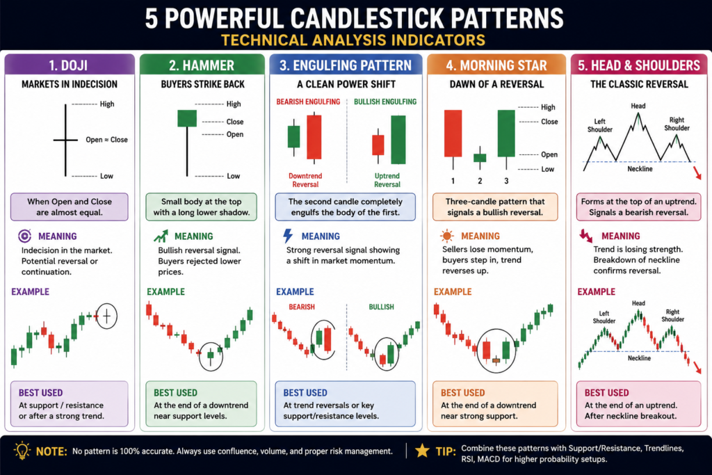
The Doji — Markets in Indecision

Four types of Doji candlestick patterns Standard Doji Open ≈ Close Long-Legged Doji High volatility Dragonfly Doji Bullish signal Gravestone Doji Bearish signal High Low

Walk up to any experienced trader and mention the word “Doji” and watch their eyes light up. Few candlestick patterns carry as much psychological weight in a single candle as this one. The Doji forms when a session’s opening and closing prices are virtually identical — leaving a candle with almost no real body, flanked by upper and lower wicks that stretch outward like wings.

What it’s telling you is simple but profound: neither bulls nor bears won that session. Every dollar of buying pressure was met with an equal dollar of selling pressure. The market is pausing, reconsidering, balanced on a knife-edge.

Pro Trading Insight A single Doji is interesting. A Doji appearing after a strong uptrend or downtrend is potentially significant. Always wait for the next candle to confirm direction before entering a trade based on a Doji alone.

The Dragonfly Doji — with its long lower shadow — suggests that sellers drove price down sharply during the session, but buyers clawed it all the way back to the open. That kind of buyer conviction is often a reliable bullish reversal signal, especially at a key support level. The Gravestone Doji does the opposite, telling you buyers pushed hard, got rejected at the top, and couldn’t hold gains. At a resistance zone, that’s a warning.

Context is everything with Doji patterns. In isolation they mean little. But when they show up at the end of a prolonged move, near a major support or resistance, or confirmed by high volume — they become one of the most honest signals the market will ever give you.

~58% Reversal rate (at extremes)
1 Bar Pattern length
All Timeframes valid
02

Reversal Signal Bullish

The Hammer — Buyers Strike Back

Hammer and Hanging Man candlestick patterns with context After downtrend Hammer Body Long shadow After uptrend Hanging Man Bullish Reversal Bearish Reversal

Picture a battle. Sellers have been dominating for several sessions, driving price lower. Then one session, they push hard again — but this time, buyers show up with force. Price plummets during the session, but by the close, buyers have pushed it right back up near the open. The result is a small body sitting at the top of a long lower shadow — shaped exactly like a hammer driving a nail.

That long lower shadow — ideally twice the height of the body — is the key. It’s physical evidence that sellers tried and failed. The buyers absorbed every ounce of selling pressure and reclaimed the high ground. When this pattern appears after a downtrend, near a support level, it’s one of the cleanest bullish reversal signals in technical analysis.

The Rule of Two The lower shadow should be at least twice the length of the candle’s real body. The shorter the upper shadow, the more decisive the rejection. A hammer with no upper wick whatsoever is an exceptionally clean signal.

Now flip the context entirely. Put that same shape — same small body, same long lower shadow — at the top of a confirmed uptrend. Suddenly it becomes a Hanging Man, and the interpretation reverses entirely. Here, the pattern is saying something unsettling: even in an uptrend, sellers were able to push price down significantly during the session. Buyers recovered, yes — but should we be worried about tomorrow?

The answer depends on what follows. Both patterns require confirmation from the next candle. A hammer followed by a strong bullish candle is a legitimate entry signal. A Hanging Man followed by a bearish candle closing below its low is a serious warning to reduce long exposure.

~62%Accuracy rate
2× minShadow-to-body ratio
Daily+Best timeframes
03

Reversal Signal Bullish Bearish

The Engulfing Pattern — A Clean Power Shift

Bullish and Bearish Engulfing candlestick patterns side by side Bullish Engulfing Day 1 Day 2 Body engulfs prior candle Prior body Bearish Engulfing Day 1 Day 2 Body engulfs prior candle

If the Doji is a question mark, the Engulfing pattern is an exclamation point. This two-candle formation leaves absolutely no ambiguity about who just seized control of the market. In a Bullish Engulfing, a small bearish candle is completely swallowed — “engulfed” — by the body of the following bullish candle. The larger body completely overpowers the prior session’s price range.

Think about what that means in market terms. Yesterday’s sellers pushed price down all day. Today, buyers not only recovered every penny of that loss — they surpassed it, closing significantly above yesterday’s open. That’s not just a reversal; it’s a statement of intent. Sentiment has genuinely shifted.

Size Matters — A Lot The more the engulfing candle “overshoots” the prior candle, the stronger the signal. A massive engulfing candle on high volume, appearing at a key support level after a multi-week downtrend, is one of the highest-probability setups in all of technical analysis.

The Bearish Engulfing is its mirror — a large bearish candle swallowing a small bullish candle at the top of an uptrend. The sellers didn’t just erase yesterday’s gains; they went well beyond it. After this pattern, it’s not uncommon to see a sharp reversal in the sessions that follow.

Both varieties work best when they appear at structurally important price levels — major support, resistance, a prior swing high or low. Volume is a significant confirmation factor; an engulfing candle with above-average volume is substantially more reliable than one with thin volume. Experienced traders often look for this pattern on the weekly chart to identify major trend reversals with enough momentum to carry weeks-long moves.

~63%Success rate
2 BarsPattern length
HighVolume confirmation
04

Reversal Signal Bullish

The Morning Star — Dawn of a New Trend

Morning Star bullish and Evening Star bearish three-candle reversal patterns Morning Star (Bullish Reversal) Bearish Star Gap Bullish Gap 50% of Candle 1 Evening Star (Bearish Reversal) Bullish Star Bearish 50% line

If there’s a pattern that reads like poetry in chart form, it’s the Morning Star. This elegant three-candle formation tells the story of a market that was falling, paused in exhaustion, then ignited — all in three sessions. The name is entirely intentional: just as the morning star appears in the sky before the sun rises, this pattern signals the arrival of a new bullish dawn.

Here’s how it unfolds. Session one delivers a large bearish candle — the bears are firmly in control, price has been falling. Session two opens with a downward gap and produces a small-bodied candle, either bull or bear. The small body is crucial: it tells you the bears are losing steam. They couldn’t sustain the momentum. Session three then opens higher, gaps up if you’re lucky, and closes strongly bullish — pushing well above the midpoint of that first big bearish candle.

The 50% Rule For a valid Morning Star, the third candle must close above the halfway point of the first candle’s real body. The deeper into that first candle the third candle penetrates, the stronger the reversal signal. If it closes above the first candle’s open entirely, you’ve got an extremely powerful signal.

The Evening Star is its bearish counterpart — three candles that play out the same drama in reverse at the top of an uptrend. A large bullish candle gives way to a hesitant star candle, followed by a decisive bearish candle that slashes back deep into the first candle’s gains.

What makes Morning and Evening Stars so powerful is their narrative completeness. You’re not reading one moment in time — you’re watching a three-act story of a trend exhausting itself and a new one beginning. On the daily chart, this pattern is particularly reliable in trending markets and is frequently cited by swing traders as one of their preferred entry triggers.

~65%Accuracy rate
3 BarsPattern length
Daily+Best on daily charts
05

Reversal Signal Bearish

Head & Shoulders — The Classic Reversal King

Head and Shoulders bearish reversal pattern with neckline and price target Neckline Left Shoulder Head Right Shoulder Breakdown Pattern Height = H Target (−H) Volume High vol!

Of all the patterns in technical analysis, the Head and Shoulders is arguably the most celebrated — and the most feared by those holding long positions. It’s a multi-swing reversal pattern that literally looks like a person’s silhouette: a left shoulder, a taller head in the middle, and a right shoulder approximately equal in height to the left. It forms over weeks or even months, which is precisely why it carries such predictive weight.

Here’s the narrative embedded in those price swings. During an uptrend, price rallies to form the left shoulder, then pulls back. The bulls rally again more powerfully — forming the head — but then struggle to hold the gains and pull back to roughly the same level as before. They try one more time, but this third rally fails at roughly the same height as the left shoulder. The market has attempted three times to push higher and has failed. The right shoulder’s inability to match the head’s height is a damning statement about the bulls’ deteriorating control.

The Neckline Is Everything The neckline — drawn through the two pullback lows between the three peaks — is the critical trigger. Price breaking below the neckline with significant volume is the confirmation signal. The textbook price target is calculated by measuring the distance from the neckline to the top of the head, then projecting that same distance downward from the breakout point.

Volume patterns within the formation add crucial weight to the signal. Typically, volume is highest on the left shoulder rally, lower on the head rally, and lower still on the right shoulder — a clear pattern of declining buying enthusiasm. Then, when the neckline breaks, volume often surges again as sellers pile in and stop-losses are triggered beneath that key level.

The Inverse Head and Shoulders — the same pattern flipped upside down — appears at market bottoms and signals bullish reversals. It’s one of the highest-conviction patterns in the entire technical analysis toolkit. Many veteran traders will only trade this pattern on the daily or weekly chart, where the “noise” of shorter timeframes can’t distort the structure.

~68%Success rate
WeeksFormation period
D / WBest on daily / weekly

Patterns Are a Language — Learn to Read It

Candlestick patterns don’t predict the future. What they do is give you a probabilistic edge — a systematic way of reading the crowd psychology embedded in price action, refined by centuries of collective market experience.

The traders who consistently profit from these patterns share one trait: patience. They wait for the right context — a strong prior trend, a key price level, confirming volume — before acting. They treat each pattern as one piece of evidence, not a guaranteed outcome.

Start by mastering one pattern. Watch it form in real-time across multiple assets and timeframes. Keep a trading journal. Note when it worked, when it failed, and why. That discipline, over time, is what transforms a pattern recognizer into a skilled trader.

For educational purposes only. This article does not constitute financial advice. Always do your own research and consider consulting a qualified financial advisor before making trading decisions.

© 2026 Market Insights Guide · Candlestick Patterns · Technical Analysis

Top 8 Technical Indicators Every Trader Should Know in Financial & Capital Markets

TECHNICAL INDICATORS

The financial market is a living, breathing entity. Prices surge and collapse, trends emerge and reverse, and fortunes are made or lost in the span of minutes. For centuries, traders have sought ways to decode this chaos — to find order in the noise. Technical analysis is their answer.

Unlike fundamental analysis, which asks what a company is worth, technical analysis asks what the market is doing right now. It does this through technical indicators — mathematical calculations based on historical price, volume, and open interest data — that help traders anticipate future price movements with greater precision.

Whether you’re a seasoned institutional trader on Dalal Street or a retail investor navigating global equities, understanding these indicators is not optional. It’s essential. This article walks you through the most powerful and widely-used technical indicators in capital markets today, explaining what they are, how they work, and — critically — when to use them.


What Are Technical Indicators?

Technical indicators are quantitative tools applied to price charts. They fall into four broad categories:

  • Trend indicators — tell you the direction of the market
  • Momentum indicators — tell you the speed of price movement
  • Volatility indicators — tell you how wildly prices are swinging
  • Volume indicators — tell you the strength behind price moves

Each category answers a different question. Used together, they provide a comprehensive, multi-dimensional picture of market behavior. The goal is never to predict with certainty — markets are inherently probabilistic — but to tilt the odds in your favor.


1. Moving Averages (MA) — The Foundation of Trend Analysis

If technical analysis has a cornerstone, it is the Moving Average. Simple in concept yet powerful in application, a moving average smooths out short-term price fluctuations to reveal the underlying trend direction.

Simple Moving Average (SMA) calculates the arithmetic mean of prices over a defined number of periods. A 50-day SMA, for example, averages the closing prices of the last 50 trading days and plots a single point on the chart. As each new day’s price is added and the oldest drops off, the line “moves.”

Exponential Moving Average (EMA) is a more sophisticated version that assigns greater weight to recent prices, making it more responsive to new information. Traders prefer EMAs in fast-moving markets because they react faster to sudden price changes.

How traders use them: The classic strategy involves two moving averages — a short-term (e.g., 20-day) and a long-term (e.g., 50-day or 200-day). When the short-term MA crosses above the long-term MA, it generates a Golden Cross — a bullish signal. When it crosses below, it forms a Death Cross — a bearish signal.

Moving averages are also used as dynamic support and resistance levels. In a strong uptrend, price tends to bounce off the 50-day or 200-day EMA repeatedly before continuing higher.

Best used for: Identifying trend direction, filtering trade signals, and determining support/resistance zones.


2. Relative Strength Index (RSI) — The Momentum Oscillator

Developed by J. Welles Wilder Jr. in 1978, the Relative Strength Index (RSI) is one of the most universally respected momentum indicators in existence. It measures the speed and magnitude of recent price changes on a scale of 0 to 100.

The formula compares average gains to average losses over a default 14-period lookback window. The result is plotted as a single line that oscillates between 0 and 100.

Key levels:

  • Above 70 → Overbought territory. The asset may be due for a pullback or consolidation.
  • Below 30 → Oversold territory. The asset may be due for a bounce or reversal.
  • 50 line → Acts as the dividing line between bullish (above 50) and bearish (below 50) momentum.

One of the most powerful RSI techniques is divergence. When price makes a new high but RSI fails to confirm it (making a lower high), this bearish divergence warns that the rally is losing steam. Conversely, bullish divergence occurs when price makes lower lows while RSI makes higher lows — a classic reversal signal.

Important nuance: In a strong bull market, RSI can remain in overbought territory for extended periods. Traders who automatically sell when RSI hits 70 in trending markets often exit too early. RSI is most reliable in range-bound or consolidating markets, and should always be confirmed with price action or other indicators.

Best used for: Identifying overbought/oversold conditions, spotting divergences, and gauging momentum strength.


3. Moving Average Convergence Divergence (MACD) — Trend and Momentum in One

The MACD (pronounced “mac-dee”) is arguably the most versatile indicator available to traders. Created by Gerald Appel in the late 1970s, it combines trend-following with momentum analysis, giving traders a two-for-one signal.

The MACD is constructed from three components:

  1. MACD Line = 12-day EMA minus 26-day EMA
  2. Signal Line = 9-day EMA of the MACD Line
  3. Histogram = MACD Line minus Signal Line (displayed as bars above/below a zero line)

How to read it:

  • When the MACD Line crosses above the Signal Line → bullish crossover (buy signal)
  • When the MACD Line crosses below the Signal Line → bearish crossover (sell signal)
  • When the histogram bars grow taller → momentum is increasing
  • When bars shrink → momentum is fading, possibly signaling a reversal

The zero line is also significant. When the MACD Line crosses above zero, it means the short-term average has crossed above the long-term average — a trend confirmation. When it falls below zero, the opposite is true.

Like RSI, MACD divergences are powerful. If price reaches a new high while the MACD histogram makes a lower high, the uptrend may be weakening.

Best used for: Confirming trend direction, identifying entry and exit points, and spotting momentum shifts.


4. Bollinger Bands — Volatility Meets Price Action

Bollinger Bands, developed by John Bollinger in the 1980s, are a volatility-based indicator that places dynamic envelopes around price. They consist of three lines:

  • Middle Band: A 20-day SMA
  • Upper Band: Middle Band + 2 standard deviations
  • Lower Band: Middle Band − 2 standard deviations

The bands expand when volatility increases and contract when volatility decreases — a behavior Bollinger called “the squeeze.” This is their most powerful signal: when bands narrow dramatically, it typically precedes a sharp move in price (though the direction is not always predictable from the squeeze alone).

Key signals:

  • Price touching or breaking the upper band → The market is in an extended rally. In trending markets, this is a continuation signal. In range-bound markets, it may indicate overextension.
  • Price touching or breaking the lower band → The inverse of the above.
  • The W-bottom pattern → Price touches the lower band, bounces, then retests it (making a higher low) while RSI shows bullish divergence — a strong reversal setup.
  • Riding the band → In a strong trend, price can “walk” along the upper or lower band for extended periods.

Best used for: Gauging volatility, identifying breakout potential, and spotting mean-reversion opportunities.


5. Fibonacci Retracement — The Golden Ratio in Markets

Fibonacci retracement levels are based on the famous Fibonacci sequence — a mathematical sequence found throughout nature in which each number is the sum of the two preceding ones. The ratios derived from this sequence (23.6%, 38.2%, 50%, 61.8%, and 78.6%) have an uncanny tendency to act as support and resistance levels in financial markets.

The mechanics are straightforward: you identify a significant swing high and swing low, then draw Fibonacci lines between them. The resulting levels represent potential areas where price might pause, consolidate, or reverse during a retracement.

The 61.8% level — known as the “golden ratio” — is considered the most critical. In strong uptrends, price often retraces to this level before resuming its move higher. A break below it often signals the trend may be reversing.

Traders use Fibonacci levels in two primary ways:

  1. Entry points: Entering a trade at a key Fibonacci level where price is likely to reverse.
  2. Stop loss and target placement: Setting stops just below a Fibonacci support level, and targets at the next Fibonacci resistance level.

Important note: Fibonacci levels are not magic. Their power comes from the fact that so many traders around the world watch the same levels simultaneously, creating self-fulfilling prophecies at those price points.

Best used for: Identifying retracement support/resistance, setting entry points in trending markets, and planning trade management.


6. Volume — The Underrated Indicator

Among all the indicators discussed here, volume is perhaps the most underutilized by retail traders — and the most respected by professionals. Volume represents the total number of shares, contracts, or units traded during a given period. It is the raw measure of market participation and conviction.

The cardinal rule of volume analysis: price moves on high volume are more significant and reliable than price moves on low volume.

Key volume signals:

  • Volume confirming breakout: When a stock breaks above a resistance level on unusually high volume, the breakout is likely genuine. Low-volume breakouts frequently fail.
  • Climactic volume: An enormous spike in volume after a sustained move (up or down) often signals the end of that trend as all buyers/sellers exhaust themselves.
  • Volume divergence: Price rising while volume consistently declines suggests weakening conviction — a warning sign for the trend.

On-Balance Volume (OBV), developed by Joe Granville, refines raw volume into a cumulative line. It adds volume on up days and subtracts it on down days. When OBV diverges from price (rising while price is flat, or falling while price is rising), it can signal that institutional accumulation or distribution is underway before price confirms the move.

Best used for: Confirming breakouts, identifying institutional activity, and detecting trend exhaustion.


7. Stochastic Oscillator — Comparing Price to Its Range

The Stochastic Oscillator, developed by George Lane in the 1950s, measures where the current closing price sits relative to the high-low range over a specified period (typically 14 days). The underlying logic is simple and powerful: in an uptrend, prices tend to close near the high; in a downtrend, they tend to close near the low.

The indicator produces two lines — %K (the fast line) and %D (a 3-period smoothed version of %K) — that oscillate between 0 and 100.

Key signals:

  • Above 80 → Overbought
  • Below 20 → Oversold
  • %K crossing above %D in oversold zone → Bullish crossover (buy signal)
  • %K crossing below %D in overbought zone → Bearish crossover (sell signal)

Like RSI, the stochastic is most effective in range-bound markets. In strong trends, overbought/oversold readings can persist for long periods. Divergences between the stochastic and price action are particularly powerful reversal signals.

Best used for: Short-term trading, identifying potential reversals, and complementing trend indicators.


8. Average Directional Index (ADX) — Measuring Trend Strength

One of the most common mistakes traders make is applying trend-following strategies in sideways, choppy markets — and then wondering why they keep getting stopped out. The Average Directional Index (ADX), developed by Welles Wilder, solves this problem elegantly.

ADX does not tell you which direction the market is trending. It tells you how strongly it is trending — regardless of direction.

ADX ranges from 0 to 100:

  • Below 20 → Weak or no trend (avoid trend-following strategies)
  • 20–25 → Trend beginning to develop
  • 25–50 → Strong, established trend
  • Above 50 → Very strong trend (rare and powerful)

ADX is typically plotted alongside two directional lines: +DI (measuring upward price movement) and −DI (measuring downward price movement). When the +DI crosses above the −DI while ADX is rising above 25, it signals a strengthening uptrend — a powerful buy signal. The reverse is true for downtrends.

Best used for: Filtering trade signals (only take trend-following trades when ADX is above 25), assessing trend strength, and avoiding range-bound chop.


Combining Indicators: The Art of Confluence

No single indicator works perfectly in isolation. The real edge in technical analysis comes from confluence — when multiple independent indicators align and point to the same conclusion simultaneously.

A practical example of a high-probability trade setup:

  1. Trend filter (ADX > 25 and rising) → Confirms a strong trend is in place
  2. Direction (MACD bullish crossover above zero) → Confirms upward momentum
  3. Entry trigger (RSI pulling back to 50 from above, or price at Fibonacci 61.8% support) → Provides an optimal entry point
  4. Volume confirmation (OBV rising) → Confirms institutional participation

When all four align, the probability of success is significantly higher than when only one or two signals agree. This is how professional traders use indicators — not as standalone oracles, but as a multidimensional filter for high-quality setups.


Common Pitfalls to Avoid

Over-reliance on any single indicator: Every indicator lags price to some degree — they are all derived from historical data. No indicator predicts the future; they only improve the probability of your analysis.

Indicator overload: Loading ten indicators on a single chart doesn’t increase accuracy — it creates paralysis and contradictory signals. Most professional traders use three to four complementary indicators at most.

Ignoring price action: Indicators are derived from price. Always remember that pure price action — candlestick patterns, support/resistance levels, and chart patterns — should anchor your analysis. Indicators are tools to confirm, not replace, what you see on the chart.

Ignoring the timeframe: An indicator generating a buy signal on a 5-minute chart may simultaneously be generating a sell signal on a daily chart. Always check multiple timeframes and give priority to the higher timeframe trend.


Conclusion: Mastering the Market’s Language

Technical indicators are not crystal balls. They will not make you rich overnight, and they will sometimes be wrong. But used systematically, with discipline and a clear understanding of what each indicator measures and when it works best, they give traders a decisive edge in navigating the complexity of capital markets.

The journey from understanding individual indicators to combining them into a coherent, battle-tested trading strategy takes time and practice. Start with two or three indicators from different categories — say, the 200-day EMA (trend), RSI (momentum), and volume (participation) — and study how they interact across different market conditions. Paper trade your setups before committing real capital.

The market rewards preparation, patience, and discipline above all else. Technical indicators, wielded with skill, are among the most powerful tools in a trader’s arsenal — not because they predict the future, but because they help you respond to the present with clarity and confidence.


Disclaimer: This article is for educational purposes only and does not constitute financial advice. Always conduct your own research and consider consulting a certified financial advisor before making investment decisions.